




Rays I Don’t See Why We Shouldn’t WS 2026 Shirt

Nov 02
Nov 05 - Nov 09
Nov 17 - Nov 25
Rays I Don’t See Why We Shouldn’t WS 2026 T-Shirt – Tampa Bay’s Championship Dream in Classic Comic Style
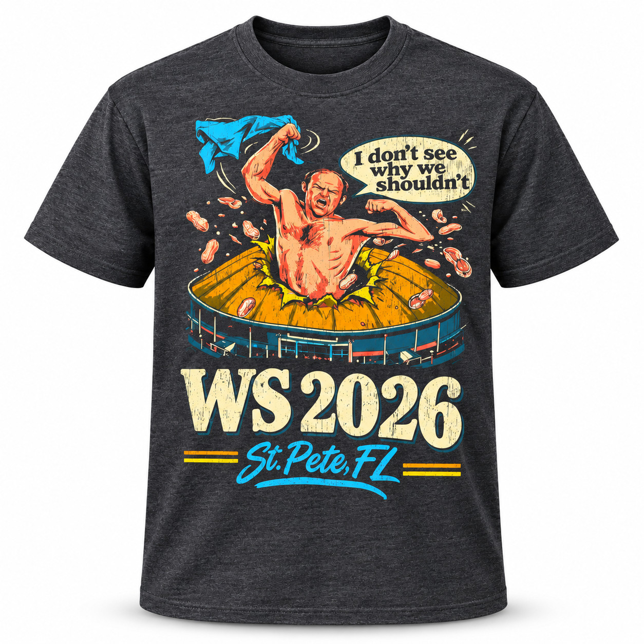
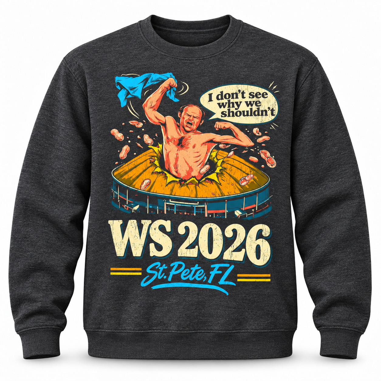
The Rays I Don’t See Why We Shouldn’t WS 2026 Shirt captures the excitement of Tampa Bay baseball through its unique comic-style imagery and nostalgic colors. With an explosive celebratory character from the stadium, large WS 2026 lettering, and bright St. Pete, FL lettering, this charcoal graphic t-shirt embodies the fearless optimism of fans dreaming of their first World Series championship.
The t-shirt features a colorful illustration inspired by classic comic art. At the center, a muscular, shirtless figure bursts from a yellow stadium structure with both hands raised in excitement.One hand swings a bright turquoise piece of fabric while the other forms a triumphant muscle-showing gesture. Baseball-inspired shapes are scattered around the figure, adding movement and emphasizing the intensity of the celebration.
Key Features and Detailed Design Elements
- Charcoal Grey Background: A dark grey background, enhanced with texture to give the shirt a vintage-inspired look.
- Expressive Central Character: An impressive celebratory muscular illustration atop a colorful stadium.
- Bright Blue Fabric Illustration: A striking turquoise shirt adds movement and contrast to the artwork.
- Comic-Style Speech Bubble: A light cream speech bubble displays a humorous quote within the design.
- Large WS 2026 Text: Large, cream-colored lettering with a worn effect emphasizes the championship theme.
- Yellow Stadium Illustration: Yellow architectural details create a vibrant backdrop for the central character.
- Abrasion print effect: The abrasion patterns on the illustrations and lettering create a retro graphic look.
- Yellow stripe accents: Small horizontal details surround the text below and complete the design.
- Classic crew neck: The traditional crew neckline complements the casual short-sleeved style.
- Colorful front image: Cream, turquoise, orange, yellow, and blue tones contrast against a dark fabric background.
Why the Distressed WS 2026 Graphic Stands Out
The shirt’s visual appeal comes from its combination of oversized lettering, expressive illustration, and carefully selected retro colors.The large cream WS 2026 text creates a strong foundation, while the stadium illustration adds depth above it. The central character introduces action and humor, making the artwork feel like a dramatic scene from a vintage comic book.Turquoise script and yellow accents bring the composition together, creating a distinctive balance between typography and illustration.
How to Style the Rays I Don’t See Why We Shouldn’t WS 2026 Shirt
For an easy game-day look, pair this charcoal graphic tee with faded blue jeans and white sneakers. The neutral gray fabric allows the turquoise and yellow artwork to become the centerpiece of the outfit.For a relaxed streetwear appearance, combine the shirt with black cargo shorts, comfortable sneakers, and a navy baseball cap. The distressed graphic also complements vintage denim jackets and lightweight casual outerwear.
Add the Shirt to your cart today and bring Tampa Bay’s championship spirit into your everyday wardrobe. Celebrate the excitement of St. Petersburg baseball with a graphic tee that turns postseason ambition into a bold, unforgettable statement.

 Rays I Don’t See Why We Shouldn’t WS 2026 Shirt
Sorry, no reviews match your current selections